Introducing Altair and generative AI to data storytelling
What is data storytelling? How can you implement data-driven stories using Python Altair? What benefits would generative AI introduce to building data stories? You’ll find the answers to each of these questions in part 1 of this book. This part introduces the use of generative AI in a progressive way: first, we will look at GitHub Copilot, and later, in chapter 4, ChatGPT and DALL-E. I chose to follow this learning strategy because it is better to first lay the theoretical foundations to understand the main concepts and then automate them, using the various tools generative AI makes available. Using this approach, you will be the full master of generative AI tools, rather than their servant.
Before we enter the wonderful world of data storytelling combined with generative AI, I want to warn you of one thing: generative AI is an ever-evolving field, so the code you read in this book may be obsolete by the time you attempt to run it (although it was updated to the latest version at the time of writing). However, the principles described always remain valid, and you can check the official documentation of generative AI tools to update the code. Indeed, the code described in this book is located on a GitHub repository, so you might even think about opening issues on broken code to keep the GitHub repository continuously updated. It would be a fantastic way to collaborate together, and I would be really grateful if you did.
In chapter 1, you’ll learn what data storytelling is and why you should use it to communicate the insights extracted during data exploration and analysis. To build a data story, you’ll also be introduced to the data, information, knowledge, wisdom (DIKW) pyramid, the model you’ll use throughout the book. Although other models exist to build data stories (e.g., the storytelling arc), I’ve chosen the DIKW pyramid as a reference for this book because I believe it’s more straightforward and effective. It acts like matryoshka dolls, where the most external piece contains all the previous ones, although every single piece can exist as a standalone object. Like the matryoshka pieces (aka nesting dolls), each step of the DIKW pyramid can live as a standalone (partial) story; however, only the last step, wisdom, contains a complete story. In the last part of this chapter, you’ll see a practical use case that applies the DIKW pyramid, which will unveil the potential of this model. I hope this simple example will pique your interest. However, if it does not meet your expectations, I ask you to be patient. Throughout the book, you will encounter many other practical case studies and examples, which I hope you can use as references in your own real-world scenarios.
In chapter 2, you’ll get your hands dirty by writing your first data story using Altair and generative AI. For now, you’ll use only Copilot, but be patient. You’ll learn how to use ChatGPT and DALL-E later in the book. In this chapter, you will only see Copilot at work. You will not simply implement examples, but you will learn the basic techniques to use Copilot as a working tool, not only with Altair, but to produce any type of code.
Chapter 3 will review the basic concepts of Altair as well as Vega and Vega-Lite, the data visualization grammars behind Altair. You’ll implement practical exercises and a final case study using the DIKW pyramid. Compared to the case studies implemented in the previous chapters, this one is slightly complex. At the end of this chapter, you will have matured enough Altair skills to be ready to use ChatGPT and DALL-E.
In chapter 4, you’ll learn how to structure a prompt for ChatGPT and DALL-E and how to use these tools for data storytelling. Before using them, you’ll review some general concepts related to artificial intelligence, machine learning, deep learning, and generative AI. This will help you to set the context of generative AI tools. In the last part of the chapter, you’ll implement a practical use case, showing the potential of generative AI in data storytelling.
As outlined in the following list, at the end of each chapter, you’ll implement a practical case study, each with a different purpose:
- Chapter 1—This case study is only theoretical (without any code) and focuses on some statistics related to an advertising campaign about pets. You’ll find the code for this example in the GitHub repository for the book.
- Chapter 2—This case study describes a simplified decision-making process related to the opportunity for a hotel to build a new swimming pool. You’ll implement two versions: one using and one without using GitHub Copilot.
- Chapter 3—This case study focuses on a data-journalism-like example, studying population growth in North America. The example is more advanced than those implemented in the previous chapters.
- Chapter 4—This case study involves again a decision-making process. This one adds generative AI to the preceding case studies.

Introducing data storytelling
This chapter covers
- What data storytelling is
- The importance of data storytelling
- Why you should use Python Altair and generative AI tools for data storytelling
- When Altair and generative AI tools are not useful for data storytelling
- How to read this book
- The data, information, knowledge, wisdom (DIKW) pyramid
The examples you will encounter throughout the book—and in this chapter—will be essential, as they aim to be as simple as possible to understand a working method. At the end of the book, you will realize that rather than having implemented examples, you will have learned a working methodology. Therefore, I ask you not to be disappointed by the simplicity of the examples but to look at the methodology behind them and how you can apply it in your work, which is certainly more complex than the examples described in this book. So let’s start our journey!
1.1 The art of data storytelling
Data storytelling is a powerful way to share data insights by transforming them into narrative stories. It is an art you can use for any industry, such as government, education, finance, entertainment, and healthcare. Data storytelling is not only for data scientists and analysts; it’s for anyone who has ever wanted to tell a story with data.
To move from data visualization to data storytelling, you need to change perspective. Instead of looking at the data from your point of view, you will have to look at it from the point of view of the people you will tell it to—in other words, the audience. Figure 1.1 shows the journey from data to the intended audience, as viewed through the eyes of both the skilled data scientist (represented on the left) and the eagerly
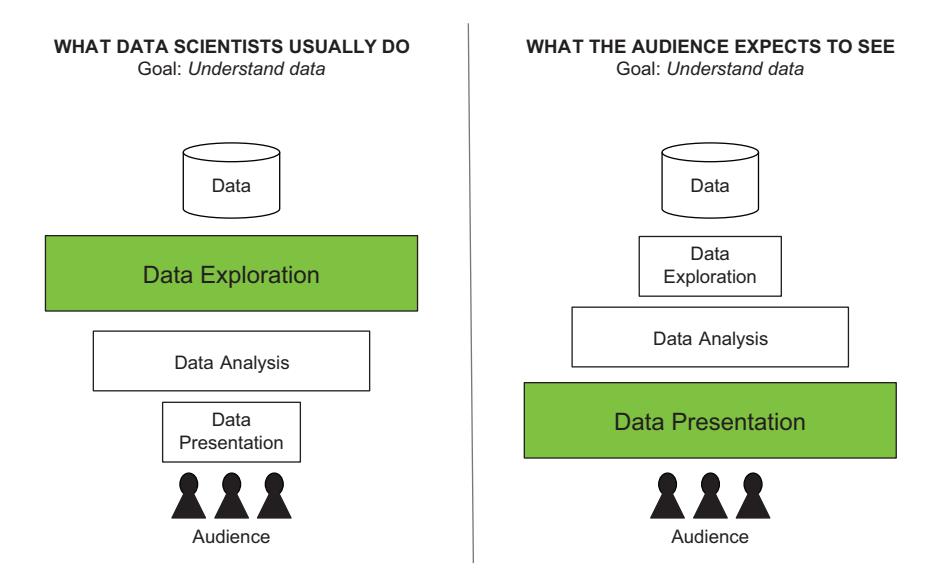
Figure 1.1 The data science flow from the data scientist’s perspective (on the left) and the audience’s perspective (on the right)
awaiting audience (represented on the right). The flow consists of three major phases: data exploration, analysis, and presentation. The size of each box reflects the amount of time devoted to its respective phase. While data scientists and audiences share a common goal (that is, to grasp the essence of the data truly), how they achieve said goal varies. Data scientists understand data during the data exploration phase, whereas audiences take center stage during data presentation.
Data storytelling can help data scientists and analysts to present and communicate data to an audience. You can think of data storytelling as the grand finale of the data science life cycle. It entails taking the results of the previous phases and transforming them into a narrative that effectively communicates the results of data analysis to the audience. Rather than relying on dull graphs and charts, data storytelling enables you to bring your data to life and communicate insights compellingly and persuasively. Data storytelling gives the audience an opportunity to feel emotions and experience wins and setbacks while pursuing a goal.
More formally, data storytelling builds compelling stories, supported by data, allowing analysts and data scientists to present and share their insights interestingly and interactively. The ultimate goal of data storytelling is to engage the audience and inspire them to make decisions. In some cases, including business scenarios, data is not the first step; to begin with, you have in mind a narrative or a hypothesis. Then, you search for data that confirms or negates it. In this case, you can still have data storytelling, but you must pay attention not to alter your data to support your hypothesis. Brent Dykes, a wellknown consultant in storytelling training, suggests the following approach: “Whenever you start with the narrative and not the data, it requires discipline and open-mindedness. In these scenarios, one source of risk will be confirmation bias. You will be tempted to cherry-pick data that confirms your viewpoint and ignore conflicting data that doesn’t.” (Dykes, 2023) Remember to build your data stories on accurate and unbiased data analysis. In addition, always consider the data you are analyzing.
Some time ago, I had the opportunity to work on a cultural heritage project on which I had to automatically analyze entities from the transcripts of a registry of names dating back to around 1700–1800. The goal was to calculate some statistics about the people in the register, such as the most frequently appearing name, the number of births by year, and so on. Sitting at my computer, I calculated and visualized data statistics. The project also involved linking these people to their graves to build an interactive cemetery map. At some point in the project, I had the opportunity to visit the cemetery. As I walked through it, the rows upon rows of headstones made me stop. It hit me like a ton of bricks: every name etched into those stones represented a life. Suddenly, the numbers and statistics I had been poring over in my datasets became more than just data points—they were the stories of real people. It was a powerful realization that changed the way I approached my work. That’s when I discovered the true power of data storytelling. It’s not just about creating fancy graphs and charts—it’s about bringing the people behind the data to life. We have a mission to give these people a voice, to ensure that their stories are heard. And that’s exactly what data storytelling does; it gives
a voice to people often buried deep within the numbers. Our mission as data storytellers is to bring these stories to the forefront and ensure they are heard loud and clear.
In this book, you’ll learn two technologies to transform data into stories: Python Vega-Altair (or simply Altair) (https://altair-viz.github.io/) and generative AI tools. Python Altair is a Python library for data visualization. Unlike the most known Python libraries, such as Matplotlib and Seaborn, Altair is a declarative library where you specify only what you want to see in your visualization. This aspect is beneficial for quickly building data stories without caring about how to build a visualization. Altair also supports chart interactivity, so users can explore data and interact with it directly.
Generative AI is the second technology you’ll use to build data stories in this book. We will focus on ChatGPT to generate text, DALL-E to generate images, and GitHub Copilot to generate the Altair code automatically. I chose to use GitHub Copilot to generate code, rather than ChatGPT, because Copilot was trained with domain-specific texts, including GitHub and Stack Overflow codes. Instead, ChatGPT is more general purpose. At the time of writing, generative AI is a very recent technology, still in progress, which translates a description of specifications or actions into text.
Data storytelling is about more than communicating data; it’s about inspiring your audience and inviting them to take action. Good data storytelling requires a mix of art and science. The art is in finding the right story, while the science is in understanding how to use data to support that story. When done well, data storytelling can be a potent tool for change. In the remainder of this section, we’ll briefly cover three fundamental questions about data storytelling.
1.1.1 Why should you use data storytelling?
Data storytelling enables you to convey the results of your data analysis process, using narratives that can be easily understood by an audience. Throughout this book, we will see many examples and case studies. For example, you will see how to transform the raw chart in figure 1.2 into the data story shown in figure 1.3.
Data storytelling allows you to fill the gap between simply visualizing data and communicating it to an audience. Data storytelling improves your communication skills and standardizes and simplifies the process of communicating results, making it easier for people to understand and remember information. Data storytelling also helps you learn to communicate more effectively with others, improving personal and professional relationships.
Use data storytelling if you want to do any of the following:
- Focus on the message you want to communicate and make data more understandable and relatable.
- Communicate your findings to others in a way that is clear and convincing.
- Connect with your audience on an emotional level, which makes them more likely to take action.
- Inspire the audience to make better decisions by helping them understand your data more deeply.
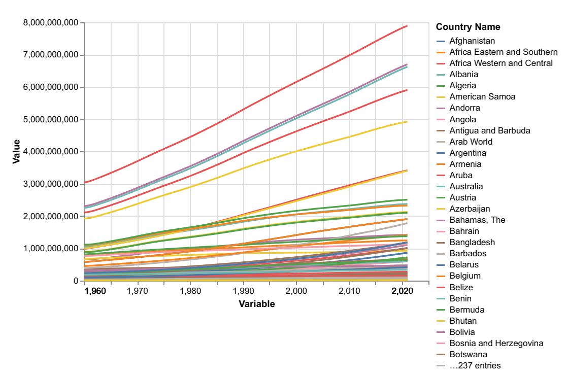
Figure 1.2 An example of a raw chart
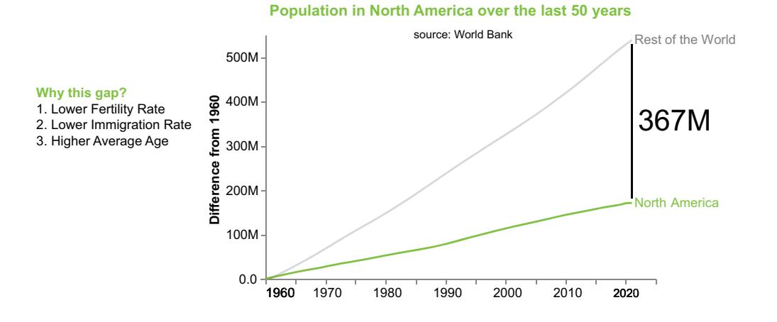
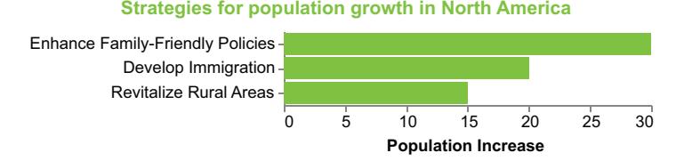
Figure 1.3 The raw chart from figure 1.2 transformed into a data story
1.1.2 What problems can data storytelling solve?
Use data storytelling if you want to communicate something to an audience in the form of writing reports, doing presentations, or building dashboards.
WRITING REPORTS
Imagine you must write a sales report for a retail company. Instead of presenting raw numbers and figures, you can weave a data story about the performance of different product categories. Start by identifying the most crucial aspects of the data, such as the top-selling products, emerging trends, or seasonal fluctuations. Then, use a combination of visualizations, anecdotes, and a logical narrative flow to present the information.
You can build a story around your data, such as by introducing a problem, building suspense, and concluding with actionable recommendations. When writing reports, use data storytelling to highlight the most important parts of your data and make your reports more engaging and easier to understand.
DOING PRESENTATIONS
Consider a marketing presentation in which you must demonstrate various marketing campaigns’ effectiveness. Instead of bombarding the audience with numerous charts and statistics, focus on creating a compelling narrative that guides them through how the campaigns unfolded and their impact on the target audience. Finally, show potential next steps to follow. In presentations, use data storytelling to engage your audience and help them understand your message better.
BUILDING DASHBOARDS
Let’s imagine you are developing a sales performance dashboard for a retail company. Instead of presenting a cluttered interface with overwhelming data, focus on guiding users through a narrative, highlighting key insights. When building dashboards, use data storytelling to build more user-friendly and informative dashboards.
1.1.3 What are the challenges of data storytelling?
Crafting compelling data stories is no easy feat. It demands time to ensure engaging narratives packed with valuable information. Moreover, it is a team effort because it involves bringing together individuals from diverse backgrounds, each with their own expertise and perspectives, to work collaboratively. This collaboration can be challenging, but it’s essential for weaving together a cohesive and impactful data story.
Creating data stories involves two key challenges: time and teamwork. Investing in these areas is crucial to captivate audiences and effectively communicate insights.
Now that we’ve covered when to use data storytelling, what problems it can solve, and what makes it unique, we’re ready to consider questions relating to our two tools: Python Altair and generative AI tools. We will do that in the next section.
1.2 Why should you use Python Altair and generative AI for data storytelling?
Python provides you with many libraries for data visualization. Many of them, including Matplotlib and Seaborn, are imperative libraries, meaning you must define exactly how you want to build a visualization. Python Altair, instead, is a declarative library, meaning you specify only what to visualize. Using Python Altair for data storytelling instead of other imperative libraries allows you to quickly build your visualizations.
For example, to plot a line chart using Matplotlib, you must specify explicitly the x and y coordinates, set the plot title and labels, and customize the appearance.
Listing 1.1 Imperative library
import matplotlib.pyplot as plt
x = [1, 2, 3, 4, 5]
y = [1, 4, 9, 16, 25]
plt.plot(x, y)
plt.title('Square Numbers')
plt.xlabel('X')
plt.ylabel('Y')
plt.show()
NOTE The chart builds a line chart in Matplotlib. You must define the single steps to build the chart: (1) set the title, (2) set the x-axis, (3) set the y-axis.
Declarative visualization libraries, like Altair, enable you to define the desired outcome, without specifying the exact steps to achieve it. For instance, using Altair, you can simply define the data, define the x and y variables, and let the library handle the rest, including axes, labels, and styling, resulting in a more concise and intuitive code.
Listing 1.2 Declarative library
import altair as alt
import pandas as pd
df = pd.DataFrame({'x': [1, 2, 3, 4, 5], 'y': [1, 4, 9, 16, 25]})
chart = alt.Chart(df).mark_line().encode(
 x='x',
 y='y'
).properties(
 title='Square Numbers'
)
chart.save('chart.png')
NOTE The chart builds a line chart in Altair. You must define the chart type (mark_line), the variables, and the title.
In imperative Matplotlib, you had to define the axis in a certain way and let the library handle it; however, in the declarative library, you define the code with x and y variables with axis labels and styling so that, as a creator, you can be more specific and directional in the chart you intend to create and expand.
Generative AI is a subset of artificial intelligence techniques involving creating new, original content based on patterns and examples from existing data. It enables computers to generate realistic and meaningful outputs, such as text, images, or even code. In this book, we will focus on ChatGPT to generate text, DALL-E to generate images, and GitHub Copilot to assist you while coding:
- ChatGPT—An advanced language model developed by OpenAI. Powered by the GPT-3.5 or GPT-4 model, it is designed to engage in human-like conversations and provide intelligent responses.
- DALL-E—A generative AI model created by OpenAI. It combines the power of GPT-3 with image generation capabilities, allowing it to create unique and realistic images from textual descriptions.
- GitHub Copilot—A new tool powered by OpenAI Codex that assists you while writing your code. In GitHub Copilot, you describe the sequence of actions that your software must run, and GitHub Copilot transforms it into a runnable code in your preferred programming language. The ability to use GitHub Copilot consists of learning how to describe the sequence of actions. GitHub Copilot is a for-fee tool, but you can apply the concepts described in this book to other popular AI code assistants as well.
Combining Python Altair and generative AI tools will enable you to write compelling data stories more quickly directly in Python. For example, we can use Copilot to assist us in generating the necessary code snippets, such as importing the required libraries, setting up the plot, and labeling the axes. In addition, Copilot’s contextual understanding helps it propose relevant customization options, such as adding a legend or changing the color scheme, saving time and effort in searching for documentation or examples.
While generative AI tools are still in their early stages, some promising statistics reveal they increase workers’ productivity. A study by Duolingo, one of the largest language learning apps, reveals that the use of Copilot in their company has increased developers’ speed by 25% (Duolingo and GitHub Enterprise, 2022). Compass UOL, a digital media and technology company, ran another study, asking experienced developers to measure the time it took to complete a use case task (analysis, design, implementation, testing, and deployment) during three distinct periods: without using AI, before its availability was widespread; utilizing AI tools available through 2022; and employing modern generative AI tools, such as ChatGPT. Results demonstrated that developers completed the tasks in 78 hours before AI, 56 hours with the AI used
through 2022, and 36 hours with the new generative AI. Compared to the pre-AI era, there is an increase in speed of 53.85% with the new generative AI (figure 1.4).

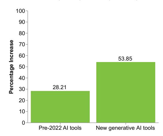
Figure 1.4 The results of the tests conducted by Compass UOL
1.2.1 The benefits of using Python in all the steps of the data science project life cycle
Many data scientists and analysts use Python to analyze their data. Thus, it should be natural to build the final report on the analyzed data in Python. However, data scientists and analysts often use Python only during the central phases of the data science project life cycle. Then, they move to other tools, such as Tableau and Power BI, to build the final report, as shown in figure 1.5. This requires adding other work, which includes exporting data from Python and importing them into the external application. This export/import operation, in itself, is not expensive, but if, while building the report, you realize that you have made a mistake, you need to modify the data in Python and then export the data again. If this process is repeated many times, there is a risk of significantly increasing the overhead until it becomes unmanageable.
This book enables data scientists and analysts to run each step of the data science project life cycle in Python, filling the gap of exporting data to an external tool or framework in the last phase of the project life cycle, as shown in figure 1.6. The advantage of using only Python is that programmers can build their reports even during the intermediate stages of their experiments, without wasting time transferring data to other tools, such as Tableau or Power BI.
1.2.2 The benefits of using generative AI for data storytelling
In general, you can use generative AI as an aid throughout the entire life cycle of a data science project. However, in this book, we will focus only on generative AI in the data presentation phase, which corresponds to the data storytelling phase.
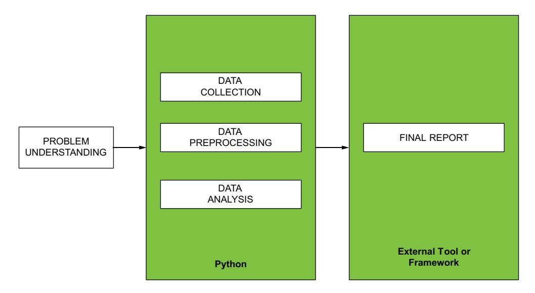
{alt=”Diagram showing the traditional data science project lifecycle with different technologies used at each phase.”}
Figure 1.5 In the traditional approach, data scientists use different technologies during different phases of the data science project life cycle.
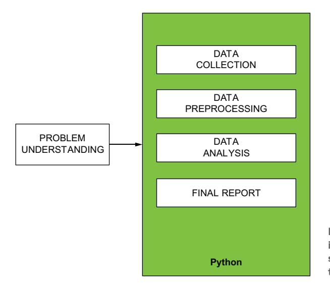
{alt=”Diagram illustrating the proposed data science project lifecycle where one technology is used consistently across all phases.”}
Figure 1.6 In the approach proposed in this book, data scientists use the same technology during all phases of the data science project life cycle.
The introduction of generative AI tools to aid the data presentation phase allows you to devote the effort and time you saved to the data presentation phase, obtaining better results. Thanks to generative AI tools, you can make the audience understand your data (figure 1.7). Now that we’ve discussed the benefits of the tools of choice in this book, we will next briefly discuss contexts in which these tools are not as effective.
WHAT DATA SCIENTISTS DO IS WHAT THE AUDIENCE EXPECTS TO SEE
Goal: Understand data
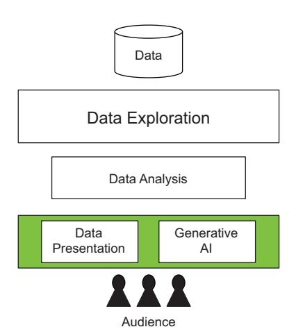
{alt=”Diagram showing how generative AI in the data presentation phase leads to better charts and audience understanding.”}
AI Figure 1.7 Introducing generative AI in the data presentation phase helps you build better charts in less time, enabling the audience to understand your message.
1.3 When Altair and generative AI tools are not useful for data storytelling
While Python Altair and generative AI tools are handy for building data stories very quickly, they are not useful when analyzing big data, such as gigabytes of data. You should not use them for the following tasks:
- Complex exploratory data analysis—Exploratory data analysis helps data analysts summarize a dataset’s main features, identify relationships between variables, and detect outliers. This approach is often used when working with large datasets or datasets with many variables.
- Big data analytics—Big data analytics analyzes large datasets to uncover patterns and trends. To be effective, big data analytics requires access to large amounts of data, powerful computers for processing that data, and specialized software for analyzing it.
- Complex reports that summarize big data—Generating detailed reports requires robust data processing capabilities and advanced reporting tools, especially when dealing with big data.
Altair enables you to build charts using datasets of up to 5,000 rows quickly. If the number of rows exceeds 5,000, Altair still builds the chart, but it’s slower. For complex data analytics, use more sophisticated analytics platforms, such as Tableau and Power BI. Though we say this combo is not ideal for big data, if it is feasible to bring your data to below 5,000 rows using data preprocessing, then Altair and generative AI can be a good combo for your storytelling. In addition, consider that you should pay a fee to use generative AI tools, so avoid them if you do not have a sufficient budget.
1.4 Using the data, information, knowledge, wisdom pyramid for data storytelling
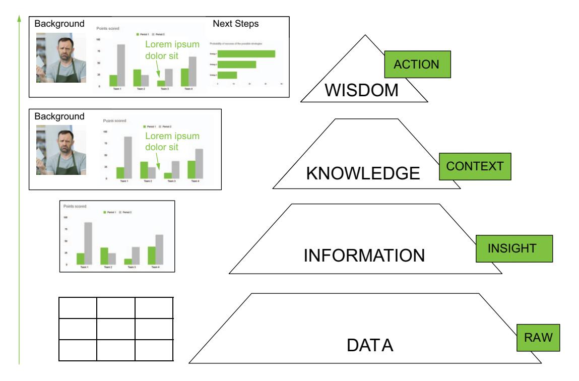
The primary focus of this book is a significant concept known as the data, information, knowledge, wisdom (DIKW) pyramid (figure 1.8), which we believe gives data scientists and analysts the macro steps to build data stories. We’ll cover the DIKW pyramid more extensively in chapter 5. We introduce the DIKW pyramid here because using it to build data stories is a fundamental concept for this text.
{alt=”Diagram of the Data, Information, Knowledge, Wisdom (DIKW) pyramid.”}
Figure 1.8 The DIKW pyramid
The DIKW pyramid provides macro steps to transform data into wisdom, following other intermediate steps, which include information and knowledge. It is composed of the following elements:
- Data—The building block at the bottom of the pyramid. Usually, we start from a significant amount of data, more or less cleaned.
- Information—Involves extracting insights from data. The information represents organized and processed data that are easy to understand.
- Knowledge—Information interpreted and understood through a context that defines the data background.
- Wisdom—The knowledge enriched with specific ethics that invites you to act in some way. Wisdom also proposes the next steps after we understand the data.
This book describes how to use the elements of the DIKW pyramid as progressive steps to transform your data into compelling data stories. This idea is not new in data storytelling; Berengueres and Sandell proposed this approach (2019). The novelty of this book lies in the combination of the use of the DIKW pyramid, Python Altair, and generative AI. In this section, we will introduce the fundamentals of DIKW that will be applied throughout this book, and we’ll explore how to climb each level of the pyramid.